
Creating stunning graphics doesn’t require a graphic design degree. Instead, all you need is a grasp of fundamental graphic design principles to deliver a seamless user experience and effectively convey messages through visuals or text.
In graphic design, there are four fundamentals:
- Color theory
- Imagery
- Typography
- Composition
In this blog, we’ll look at each of these fundamentals so you come away with a deeper understanding of graphic design and how to use it in your marketing.
1. Color Theory
Color plays a pivotal role in your designs, serving to capture attention, convey significance, and enhance aesthetics. Often, we instinctively assess objects based on their color, quickly forming judgments about their desirability, professionalism, or appeal.
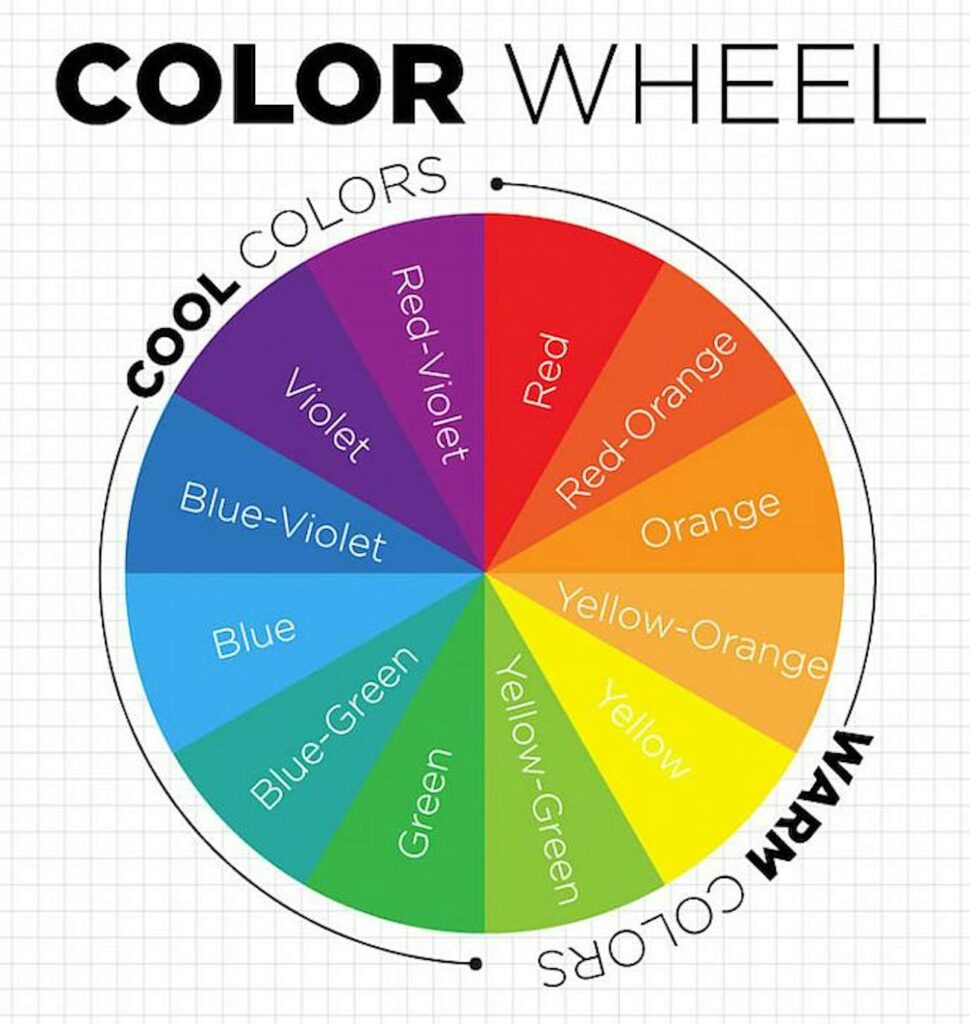
Central to effective color use is understanding contrast—the degree to which one color stands out against another. By leveraging contrasting colors within an image, for instance, you can ensure that text pops against its background, enhancing readability.
Complementary colors, like yellow and purple or blue and orange, offer maximum visual contrast when paired together. Take, for example, Dunkin’ Donuts’ menu, cleverly employing color to align with their iconic orange and pink logo.
Contrast isn’t merely about aesthetics; it can also guide user actions. For instance, a strong contrast between a call-to-action button and surrounding elements can prompt increased ‘click-through’ rates, directing user behavior effectively.
A color wheel serves as a valuable tool for assessing color contrast and relationships. Complementary colors, positioned opposite each other on the wheel, provide stark visual differentiation. Click here for read more about it.
Moreover, colors convey implicit meanings, offering visual cues to users. For instance, a green button typically signifies affirmative actions like ‘OK’ or ‘Accept.’ However, deviating from expected color associations—such as designing a large ‘Accept’ button in red—can lead to user confusion and potentially adverse outcomes.

What do different colors mean for your brand?
Let’s delve into the most commonly utilized colors by brands and the emotions they elicit from their audience.
Red is a potent hue, capable of evoking both positive and negative emotions, and instilling a sense of urgency, making it a powerful tool for boosting sales. Its appetite-stimulating properties also make it a popular choice in the fast-food industry, exemplified by brands like KFC and Wendy’s.
Orange radiates a light-hearted and playful vibe, making it suitable for brands aiming for a less corporate feel. Deeper shades of orange, reminiscent of autumn, align well with earthy brands, as seen with The Home Depot.
Green, known for its soothing effect, is synonymous with health and vitality. It’s commonly employed by brands in the health and food sectors, signaling wellness and freshness. Additionally, green can symbolize growth and authority, appealing to financial or military organizations, as evidenced by brands like Whole Foods and BP.
Blue exudes a sense of calmness and rationality, along with attributes of strength, wisdom, and trust. While it’s a safe color choice, brands must assess its effectiveness in standing out within their respective industries. Facebook, now Meta, is a prime example of successfully incorporating blue into its branding strategy.
Pink has traditionally been associated with femininity, embraced by brands like Cosmopolitan Magazine and Barbie. However, it has transcended gender stereotypes and is now utilized by mainstream brands, such as Lyft, to challenge norms and convey youthfulness, comfort, and hope.

Black symbolizes luxury and authority, often paired with bright colors to infuse sophistication and energy. It finds resonance in industries like sports and fashion, as seen with iconic brands like Apple and Nike.
White and silver represent cleanliness and modernity, lending a sleek and minimalist aesthetic to designs. While they can lack personality on their own, they serve as effective complements to more vibrant hues. Brands like Apple and Nike adeptly utilize white and silver to achieve a contemporary and refined look, especially when contrasted with black elements.
2. Imagery

Imagery in graphic design plays a crucial role in conveying messages, creating visual impact, and evoking emotions. Here are some key aspects of imagery in graphic design:
Visual Communication:
Imagery is a powerful tool for communicating ideas and messages without the need for words. It can convey complex concepts, tell stories, and create a connection with the audience.
Brand Identity:
Images are often a central element in establishing and reinforcing a brand’s identity. Consistent use of specific colors, styles, or types of imagery can help create a recognizable and memorable brand image.
Emotional Impact:
The right imagery can evoke emotions and resonate with the audience. Whether it’s joy, excitement, nostalgia, or empathy, carefully selected images contribute significantly to the overall emotional tone of a design.
Storytelling:
Imagery can be used to tell a narrative or convey a sequence of events. This is especially powerful in advertising, where a series of images can unfold a story that captures the viewer’s attention and interest.
Symbolism and Metaphor:
Graphic designers often use symbolic or metaphorical imagery to convey abstract ideas. A well-chosen symbol or metaphor can add depth and layers of meaning to a design.
Color and Tone:
Imagery contributes significantly to the color palette and overall tone of a design. The choice of colors in images can influence the mood and perception of the design.
Cultural Relevance:
Depending on the target audience and context, imagery should be culturally relevant. Understanding the cultural connotations of certain images is crucial to avoid misinterpretation.
Accessibility
Consideration for accessibility is important in graphic design. Alt text for images, proper contrast, and clarity in visual elements ensure that the design is inclusive and can be understood by a diverse audience.
3. Typography
How about the typography, or fonts you opt for? It’s crucial to select fonts that don’t stray too far from the norm when crafting your visuals.
Readers anticipate encountering familiar fonts like Arial, Helvetica, or Roboto. Limit the use of font families to two or three at most on a single webpage, and even fewer for ads and images.
Consider incorporating complementary fonts to strike a balance. Pair an ‘introverted’ font with an ‘extroverted’ one, or combine a distinct display font with a more neutral counterpart, as seen in the example for Frank Chocolate.
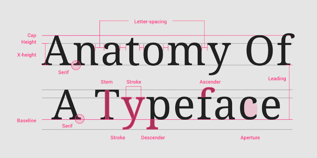
Wondering what a font family entails? Essentially, it’s a collection of fonts sharing common design styles. For instance, the Roboto family encompasses bold, italic, and thin styles.
You’ll also encounter Serif and Sans-serif fonts. Serifs are small decorative lines added to characters, with Times Roman being a common example. Conversely, Sans-serif fonts, like Helvetica, lack these decorative lines.
Go From Beginner to Expert in
Just 8 Months!
With Purdue PG Digital Marketing Program
Serif fonts enhance text readability in content like blogs, articles, or newspapers, particularly in print media. Aim for no more than 10 words per line. For headings, opt for a heavy-weight sans-serif font in a larger size to ensure proper emphasis based on priority.
Avoid directly embedding text into images; instead, collaborate with your web team to overlay responsive text. Text embedded in images can appear too small and illegible on mobile devices.
Localization is another factor to consider. Text within images cannot auto-translate, as demonstrated in the example of a site translated to Hungarian using Google Translate. Calls-to-action rendered as images hinder translation efforts.
When adding text to social media or blog images, ensure adequate color contrast. Analyze the background color variations to enhance text legibility, such as darkening the border for improved contrast.
For digital accessibility, prioritize elements like alt text for images, link text, and color contrast to enhance the customer journey across various touchpoints in your design.
4. Compositions
Certainly! Composition in graphic design is the art and science of arranging visual elements to create a visually appealing and effective design. It involves the intentional organization of various design elements to guide the viewer’s eye and convey a clear message. Here are key principles and considerations for effective composition:
Balance:
Achieve visual equilibrium by distributing visual elements evenly. This can be done symmetrically, where elements are mirrored on each side of a central axis, or asymmetrically, where different elements of varying visual weight are balanced.
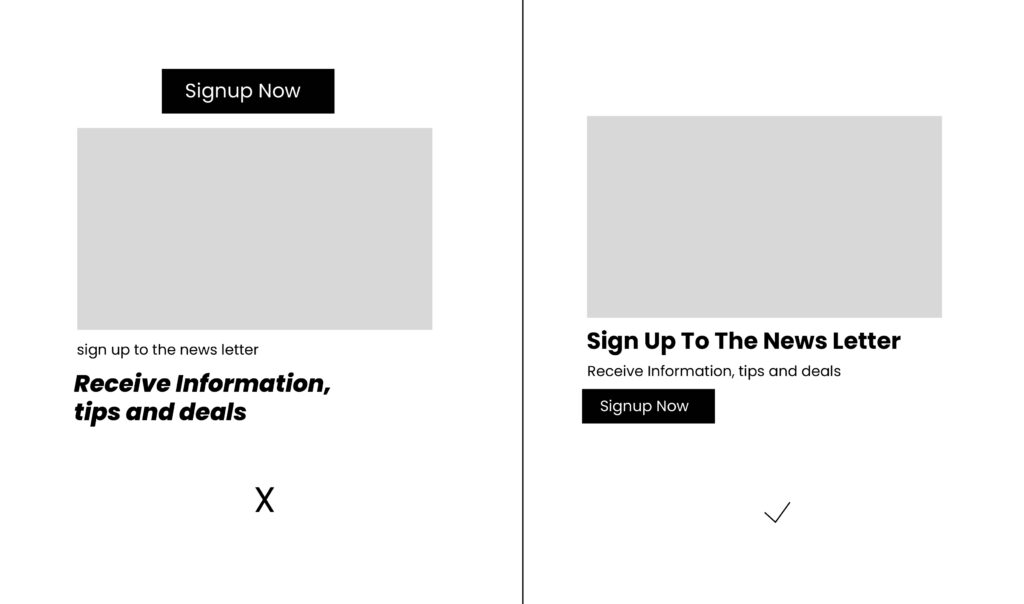
Hierarchy:
Establish a clear order of importance among design elements. This can be achieved through variations in size, color, contrast, or placement to guide the viewer’s attention and create a visual hierarchy.
Alignment:
Create a sense of order by aligning elements along a common axis. Consistent alignment contributes to a clean and organized appearance. Intentional misalignment can be used for dynamic and engaging layouts.
Repetition:
Repeat specific visual elements, such as shapes, colors, or patterns, to create unity and cohesion in the design. Repetition establishes a rhythm and reinforces the overall visual theme.
Proximity:
Group related elements together to visually connect them. Effective use of negative space, or whitespace, can provide separation and emphasize relationships between elements.
Contrast:
Use variations in color, size, and style to create visual interest and highlight important elements. Contrast helps establish a dynamic and engaging composition.
Scale and Proportion:
Adjust the size of elements relative to one another to convey importance and create emphasis. The golden ratio, a mathematical proportion, can be applied for aesthetically pleasing layouts.
Simplicity:
Strive for clarity by avoiding unnecessary elements. Create a clean and clutter-free design to ensure that the intended message is easily understood.