

Discover the 10 critical mobile SEO mistakes to steer clear of, safeguarding your presence in search engine results pages (SERPs), enhancing site traffic, and ensuring user satisfaction across all devices.
Since the advent of “mobilegeddon” in 2015, Google has consistently emphasized the shift to mobile-first indexing, underscoring its paramount importance.
Mobile-first indexing entails Google primarily crawling your mobile site, with desktop sites being secondary. Even if your desktop version excels, neglecting the mobile experience can lead to poor rankings.
With Google’s impending transition to 100% Mobile-First indexing in 2021, prioritizing mobile optimization is imperative. Ensure you monitor Core Web Vitals, identify mobile content opportunities, and rectify any mobile UX issues promptly.

1. Core Web Vitals: Site Speed Matters
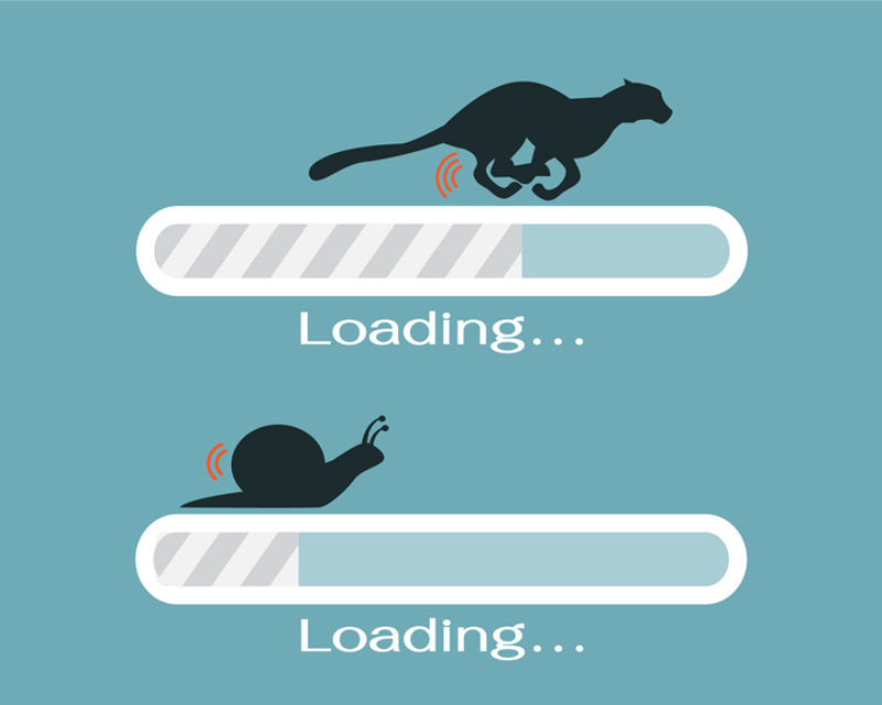
Optimizing your site’s speed is paramount; it must not only load swiftly but also facilitate rapid interaction.
Page load speed significantly impacts rankings, with two-thirds of Google’s Core Web Vitals update focusing on site speed metrics such as Largest Contentful Paint and First Input Delay.
Beyond search engine considerations, Google’s research highlights that 53% of users will abandon a page if it takes longer than 3 seconds to load.
To enhance your mobile site’s speed, implement these strategies:
Streamline requests and redirects: Simplify pages by minimizing 301 redirects, removing unnecessary elements, optimizing HTML code, and minifying CSS and JavaScript files.
Optimize images: Utilize tools within platforms like WordPress to resize images automatically and employ services like compressor.io to reduce file sizes.
Assess hosting solutions: Invest in robust hosting solutions to accommodate high volumes of traffic, especially crucial for ecommerce websites.
Monitor progress: Regularly evaluate your website’s performance using tools such as Google’s Page Speed Insights or Lighthouse.
Adopt modern web technologies: Embrace features like lazy-loading to defer loading of unnecessary or large files, enhancing overall site speed.
2. Core Web Vitals: Impact of Interstitial
Intrusive interstitial, such as pop-up ads, newsletter sign-ups, and similar banners, disrupt user access to website content. In 2021, this concern partially influenced the Cumulative Layout Shift (CLS) metric.
Cumulative Layout Shift, a facet of Core Web Vitals, aims to assess overall layout changes during page loading. This encompasses instances like pop-ups altering content positioning, interstitial shifting content, and other frustrating user experiences.
Any page offering a subpar user experience may experience lower rankings in organic search. This encompasses:
- Pop-ups covering primary content, whether upon initial access from Google search results or during page scrolling.
- Standalone interstitial that are challenging to dismiss, especially if accidental interaction leads to redirection to another page.
- Misleading layouts that deceive users into believing they are encountering an interstitial.
It’s important to note exceptions to this guideline. Interstitial ads unaffected by the new ranking signal include:
- Legally required interstitial, such as those for age verification or cookie usage.
- Login prompts for unindexable content (e.g., private emails or content behind paywalls).
- Appropriately sized banners (e.g., Safari and Chrome’s app install banners), typically occupying no more than 20 percent of the screen.
3. Missing Content: Blocked Resources
If your mobile site significantly differs from your desktop version, you might encounter instances where content is absent on one platform compared to the other.
Googlebot crawls your website similar to a regular user, so restricting access to JavaScript, CSS, and image files can potentially impact your rankings.
Review your website’s robots.txt file to identify any essential elements that are restricted.
Access Google Search Console to assess and test your robots.txt file.
Utilize Fetch as Google to address any indexing issues and conduct the mobile-friendly test to identify mobile-specific concerns.
Ensure to compare not only your desktop and mobile URLs but also the discrepancies between them. Click here for read more about Mobile SEO

4. Missing Content: Inaccessible Multimedia
Before integrating video or multimedia content onto your page, assess its impact on site speed and ensure compatibility across all devices for seamless playback.
Whenever feasible, provide a transcript alongside the content. This aids Google in indexing and assists users requiring closed captioning.
For animated content, Google suggests employing HTML5. You can conveniently create such animations using Google Web Designer, ensuring compatibility across various web browsers.
Verify that any animations on your site meet the Cumulative Layout Shift threshold for optimal user experience.
5. Missing Content: Flawed Redirects/Cross-Links
Inefficient redirects pose a significant challenge for websites lacking mobile optimization, particularly those with distinct desktop and mobile URLs.
Key areas for improvement include:
Redirecting mobile users who mistakenly land on the desktop version to the corresponding mobile page they intended to visit, instead of redirecting them back to the mobile homepage.
Urgently creating smartphone equivalents for desktop pages that lack mobile counterparts. Until these pages are live, it’s preferable to keep users on the desktop page rather than redirecting them to the mobile home page.
Ensuring mobile users requesting dynamically generated URLs are directed to appropriate mobile URLs displaying the desired information correctly.
Providing consistent content to mobile users across all devices.
Avoiding accidental linking to desktop-optimized page versions from mobile URLs.
Adopting a responsive site design, rather than employing a separate domain, is the simplest approach to mitigate common mislinking issues.
Additionally, verify your mobile site with Google to identify mapping discrepancies and detect crawling errors for rectification via Google Search Console.
6. Missing Content: Mobile-Specific 404 Errors
Consistency in content accessibility between desktop and mobile versions of your site is crucial. If content is invisible to Google on mobile, it remains unseen.
It’s imperative to address any occurrences where mobile users encounter 404 errors while attempting to access pages visible to desktop users.
Steer clear of linking to broken or absent content, and consider crawling your site from a mobile user-agent to identify any 404 errors proactively.
7. Missing Content: Structured Data
Google consistently strives to deliver comprehensive and immediate answers to user queries. Leveraging schema.org to furnish these answers can significantly enhance your visibility in mobile search results.
If you haven’t integrated Schema or Structured Data markup to organize your content, you’re overlooking a crucial factor in driving organic click-through rates (CTR). Google and its users are inclined to engage with rich snippets that provide relevant examples of sought-after information.

Various factors may hinder your rich snippets from appearing in search results, with improper mobile implementation being a notable concern.
Ensure the integrity of your structured data throughout your site by utilizing tools like the Rich Snippet tool and Structured Data testing tool.
8. Bad UX: Lack of Mobile Viewport Specification
Given the diversity in mobile screen sizes, failing to specify the appropriate viewports with the viewport meta tag can lead to pages being improperly displayed on users’ devices.
Common errors include:
- Employing fixed-width viewports, tailored only to specific devices.
- Setting inadequate minimum viewport parameters, neglecting users with smaller devices.
Fortunately, these issues are relatively straightforward to address:
- Enable user scaling.
- Manage your page’s fundamental dimensions and scaling using the meta viewport tag.
- Align the screen’s width in device-independent pixels with width=device-width.
- Incorporate initial-scale=1 to maintain a 1:1 ratio between CSS pixels and device-independent pixels.
These adjustments benefit not only mobile users and search engine crawlers but also enhance accessibility. Additionally, CSS media queries enable styling adjustments for varying screen sizes. For further guidance, refer to the Google Developers blog on Responsive Web Design Basics.
9. Bad UX: Inadequate Mobile Design
There’s often confusion between “mobile-first” and “mobile-friendly.”
“Mobile-first” indicates that Google prioritizes crawling your mobile site over your desktop site, emphasizing the importance of your mobile site.
“Mobile-friendly” signifies that your site is well-designed for mobile devices.
While being mobile-first doesn’t necessitate being mobile-friendly, success in a mobile-first environment requires mobile-friendly design.
Therefore, prioritize designing for smartphones and tablets rather than desktops.
Avoid using illegible fonts, small font sizes, and cluttered screens.
Ensure proper spacing between elements to minimize the risk of mobile users inadvertently clicking the wrong link or button.

10.Responsive Strategies: Verifying Metrics Reliability
Gain a comprehensive understanding of how the tools you utilize operate and the methodologies behind the metrics they provide.
When optimizing for both mobile and desktop platforms, employ robust site auditing tools to identify areas for improvement.
Examine various elements such as content, links, title/meta tags, and schema markup, ensuring you evaluate performance across desktop and mobile platforms.
Recognize that while different tools may offer similar functionalities, their results often vary significantly. Hence, cross-check your findings with alternative tools to validate accuracy.
Ensure a thorough comprehension of the metrics each tool generates, enabling you to prioritize those most pertinent to your business objectives.
Go From Beginner to Expert in
Just 8 Months!
With Purdue PG Digital Marketing Program
Responsive SEO
Both desktop and mobile SEO initiatives hinge on usability.
Harness your preferred tools to delve into discussions surrounding your brand among customers and competitors. Develop a deep understanding of your core offerings and target audience to construct an exceptional and optimized mobile website.
A robust SEO strategy relies on a profound understanding of your audience. This foundational research should underpin all facets of your approach, encompassing SEO, content creation, and site design. Familiarity with online consumer behavior equips you to tailor your efforts to resonate effectively with your audience.
Failing to grasp your customers’ needs and preferences contributes to common SEO pitfalls, such as selecting inappropriate keywords, crafting headlines that miss the mark, or misdirecting promotional efforts.
In essence, while diligent optimization efforts are crucial for mobile SEO success, their impact hinges on content alignment with your target audience’s interests and expectations.